目录
css引入css基础选择器选择器权重
1.CSS style sheet 层叠样式表格
2.引入:
<html>
<head>
	<title></title>
	<!-- 2.页面级css -->
	<style type="text/css">
		div{
			width:100px;
			height:100px;
			background-color: red;
		}

	</style>
	<!-- 3.引入外部CSS文件 -->
	<link rel="stylesheet" type="text/css" href="url">
</head>
<body>
	<!-- 1.行间样式 -->
	<div style="width:100px;height:100px;background-color: red;"></div>
</body>
</html>
3.选择器
<!DOCTYPE html>
<html>
<head>
	<title></title>
	<style type="text/css">
		/*
		1.id选择器:一个元素只能有一个id值,一个id值对应一个元素
		*/
		#only {
			width: 100px;
		}
		/*
		2.class选择:一个元素可以有多个class一个class可以对应多个元素
		*/
		.demo {
			width: 100px;
		}
		.demo1 {
			background-color: red;
		}
		/*
		3.标签选择器
		*/
		div {
			height: 100px;
		}
		/*4.通配符:所有标签*/
		* {
			padding: 0px;
		}
		/*
		5.属性选择器
		   选出所有有属性id的标签
		*/
		[id] {

		}
		/*所有有属性id且值为value的标签*/
		[id="value"]{

		}
	</style>
</head>
<body>
	<div id="only" class="demo">123</div>
	<div class="demo" class="demo2">123</div>
</body>
</html>
4.样式优先级
行间样式 > ID选择器 > class选择器(属性选择器) > 标签选择器 > 通配符
同权重看顺序,后面覆盖前面
!important最大 css权重:(256进制)
!important                 Infinity
行间样式                   1000
ID                         100
class|属性|伪类            10
标签|伪元素                1
通配符                     0
css复杂选择器,权重计算问题,css基础属性
1.复杂选择器
<!DOCTYPE html>
<html>
<head>
	<title></title>
	<style type="text/css">
		/*1.父子选择器/派生选择器:
			每一个层级不一定是标签
			不一定是父子,可以跨层级
		*/
		/*选择div里面所有span*/
		div span{
			background-color: red;
		}
		/*2.直接父子元素选择器
		*/
		/*只选择内容01*/
		div > em{

		}
		/*3.并列选择器:多个限制条件不加空格组合到一起*/
		/*选中2*/
		div.demo{

		}

	</style>
</head>
<body>
	<!-- 1. -->
	<div>
		<span>内容</span>
		<em>内容01</em>
		<strong>
			<em>内容02</em>
		</strong>
	</div>
	<span>内容2</span>
	<!-- 2. -->
	<div>1</div>
	<div class="demo">2</div>
	<p class="demo">3</p>
</body>
</html>
2.权重计算
只要写在同一行的选择器,权重值相加
3.分组选择器
<html>
<head>
	<title></title>
	<style type="text/css">
		/*分组选择器*/
		em,
		strong,
		span{
			background-color: red;
		}

	</style>
</head>
<body>
	<em>1</em>
	<strong>2</strong>
	<span>3</span>
</body>
</html>
4.css基础属性
font:
a.font-size:12px; --> 默认16px; 设置的是高
b.font-weight
c.font-style; --> 斜体
d.font-family; --> 字体
f.line-height:16px; --> 单行文本所占高度
g.text-indent:2em; --> 首行缩进
h.text-decoration; -->线
**em:**1 em = 1 font-size;
border:10px solid black;
5.设置颜色
a.土鳖式(纯英文单词) green
b.颜色代码 #ff4400 每两位都一样可以简化#f40
c.颜色函数 rgb(255,255,255)
d.透明色:transparent;
6.伪类选择器
a:hover{
}
css企业开发经验、习惯,盒子模型,层模型
1.css企业开发经验
a.文本垂直居中,line-height = 容器高度
b.display
	<!--
	1.行级元素 inline
	feature:内容决定元素所占位置,不可以通过CSS改变宽高
	例如:span  strong em a del

	2.块级元素 block
	feature:独占一行,可以通过CSS改变宽高
	例如:div p ul li ol form address

	3.行级块元素 inline-block
	feature:内容决定元素,可以改变宽高
	例如:img

	对应css属性:display:bolck;

	凡是带有inline的元素都有文字特性(文字分割符)
	 -->
c.开发:先定义功能再选用样式
2.盒子模型
a.盒子的三大部分:
盒子壁 border
内边距 padding
外边距 margin body默认8px
盒子内容 width + height
3.定位 position
a.absolute; 脱了原来位置进行定位:层模型,相对最近可定位的父级进行定位,如果没有可定位的父级,相对于文档定位
left(right)
top(button)
b.relative; 保留原来位置进行定位:层模型,相对于原来的位置进行定位
c.fixed; 固定定位
d.用relative进行参照,用absolute进行定位
f.居中:
position:absolute;
left:50%;
top:50%;
margin-left:-50%*width;
margin-top:-50%*top;
g.z-index:1; 层定位
h.border-radius:50%
i.两栏布局:一个div固定宽高,另一个div固定高margin另一个div宽,先写right
4.经典bug -- bfc
a.margin塌陷:父子嵌套的元素,垂直方向的margin,一起取最大值
**b.bfc: block format context **
<!-- 如何触发一个盒子的bfc
		1.position:absolute;
		2.display:inline-block;
		3.float:left/right;
		4.overflow:hidden;
-->
<!DOCTYPE html>
<html>
<head>
	<title></title>
	<style type="text/css">
	* {
		margin: 0;
		padding: 0;
	}

	.wrapper {
		margin-left: 100px;
		margin-top: 100px;
		width: 100px;
		height: 100px;
		background-color: black;
		/*1.添加border,不现实
		border-top: 1px solid red;*/
		/*2.bfc 哪个没影响就用哪一个*/
		/*overflow:hidden;*//*溢出部分隐藏*/
		/*display:inline-block;*/
		/*float:left/right;*/
		/*position:absolute;*/
	}

	.content {
		margin-left: 50px;
		margin-top: 150px;
		width: 50px;
		height: 50px;
		background-color: green;
	}

	</style>
</head>
<body>
	<div class="wrapper">
		<div class="content"></div>
	</div>
	<!-- 如何触发一个盒子的bfc
		1.position:absolute;
		2.display:inline-block;
		3.float:left/right;
		4.overflow:hidden;
	 -->
</body>
</html>
5.正常情况下区域不能共用
6.margin合并(兄弟元素,margin-button和margin-top共用一块区域):不解决,注意即可
7.浮动模型
<html>
<head>
	<title></title>
	<style type="text/css">
	* {
		margin: 0;
		padding: 0;
	}


	/*demo看不到.box,发生了层叠*/
	.box {
		float: left;
		width: 100px;
		height: 100px;
		background-color: black;
		opacity: 0.5;
	}

	.demo {
		width: 100px;
		height: 150px;
		background-color: green;
	}
	/*.wrapper看不到.content,高度自适应为0*/
	.wrapper {
		border: 1px solid black;
	}

	.content {
		float: left;
		color: #fff;
		background-color: black;
		width: 100px;
		height: 100px;
	}
	/*撑开父级的方法·1
	p {
		/*清除浮动流
		clear: both;
	}*/
	/*撑开父级的方法·2*/
	.wrapper::after {
		content: "";
		display: block;
		/**/
		clear: both;
	}
	</style>
</head>
<body>
	<!--
	1.浮动元素产生了浮动流
	所有产生了浮动流的元素,块级元素看不到他们,
	产生了bfc的元素和文本类属性(inline)的元素以及文本都能看到浮动元素
	 -->
	<div class="box"></div>
	<div class="demo"></div>

	<div class="wrapper">
		<div class="content">1</div>
		<div class="content">2</div>
		<div class="content">3</div>
		<!-- <p></p> -->
	</div>

</body>
</html>
a.浮动元素产生了浮动流
所有产生了浮动流的元素,块级元素看不到他们,
产生了bfc的元素和文本类属性(inline)的元素以及文本都能看到浮动元素
b.clear: both; 清除浮动的元素必须是块级元素
8.伪元素
伪元素存在所有标签里面
<html>
<head>
	<title></title>
	<style type="text/css">
	* {
		margin: 0;
		padding: 0;
	}

	span::before {
		content: "啥";
	}
	span::after {
		content: "哈?";
	}

	</style>
</head>
<body>
	<span>
		为天地立心
	</span>

</body>
</html>
9.扩展
凡是设置了position
; float/right;的元素,打内部把元素转换成inline-blockfloat最早用于报纸布局,文字包裹图片(给图片添加float)
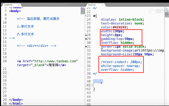
溢出容器,要打点展示
<html>
<head>
	<title></title>
	<style type="text/css">
	* {
		margin: 0;
		padding: 0;
	}
	p {
		width: 300px;
		height: 20px;
		line-height: 20px;
		border: 1px solid red;

		/*单行文本 溢出文字隐藏*/
		white-space: nowrap;/*禁止换号*/
		overflow: hidden;   /*溢出隐藏*/
		text-overflow: ellipsis;/*溢出文字打点*/

	}
	</style>
</head>
<body>
	<!-- 溢出容器,要打点展示
	1.单行文本

	2.多行文本:pc端不实现,只做截断overflow: hidden;
	 -->
	<p>
		天天想你,天天问自己,到什么时候才能忘记你
	</p>
</body>
</html>
单行文字溢出处理:
/单行文本 溢出文字隐藏/
white-space: nowrap;/禁止换号/
overflow: hidden; /溢出隐藏/
text-overflow: ellipsis;/溢出文字打点/
背景图片处理
浏览器不加载css怎么处理
其他
行级元素只能嵌套行级元素
块级元素可以嵌套任何元素
P标签不能嵌套div标签,p元素会被div风格成两组p标签
a标签不能嵌套a标签
凡是带有inline的元素都有文本特点
凡是设置了position: abolute; float: left/right;的元素,打内部把元素转换成inline-block
行级块元素底对齐,单行级块元素中有文字,外部文字与其中的文字底对齐
inherit关键字:让指定的标签,显示该属性的原设置。
本文作者:Yui_HTT
本文链接:
版权声明:本博客所有文章除特别声明外,均采用 BY-NC-SA 许可协议。转载请注明出处!